Semantic First
Write clean, meaningful HTML. We'll handle the styling.
Axiom01 is a UI framework that gets out of your way. Write clean HTML, and let us handle the beauty.
Axiom01 is not just another UI framework. It's a statement against the complexity and bloat that has taken over modern web development. We believe that a framework should serve you, not the other way around. Our philosophy is simple: write clean, semantic HTML, and let the framework do the rest.
While other frameworks encourage a sea of utility classes and `< div >` soup, Axiom champions a return to the principles of the semantic web. This approach leads to code that is more readable, more maintainable, and more accessible by default. It's a long-term investment in the health and sanity of your codebase.
Write clean, meaningful HTML. We'll handle the styling.
One class per component. No more, no less.
WCAG 2.1 AA compliance out of the box.
Axiom's layout is built on a simple, powerful idea: a single source of truth for all spacing. The CSS variable --a-space-unit is the foundation for all sizing related to space. It generates a scale of sizes (from --a-space-xs to --a-space-xxl) used for padding, margin, and gap properties throughout the framework. Adjust the slider below to see how changing this one value can globally and consistently rescale the layout of an entire application.
The container above uses gap: var(--a-space-m). Each item's margin and padding are derived from the same unit.
Axiom01 is packed with features to help you build beautiful, responsive websites with ease.
Choose from a variety of pre-built themes, or create your own with our theme wizard.
All components are designed to work on any screen size, from mobile to desktop.
The core framework is just ~12KB (gzipped), so your sites will load lightning fast.
Axiom's color system is designed to do the heavy lifting for you. By simply defining a primary color, Axiom uses color theory to automatically calculate a full, harmonious palette. It generates secondary, tertiary, and analogous colors, plus accessible "on-container" text colors for each. This means you can build beautiful, consistent, and accessible interfaces right out of the box without having to be a color expert. For a deeper dive, visit the Advanced Color Details page or use the Theme Wizard.
var(--a-color-primary)
var(--a-color-secondary)
var(--a-color-tertiary)
var(--a-color-surface)
var(--a-color-on-surface)
var(--a-color-outline)
These colors are designed for backgrounds. The "on-container" colors are guaranteed to be accessible on their corresponding container color.
var(--a-color-primary-container)
var(--a-color-secondary-container)
var(--a-color-tertiary-container)
var(--a-color-error-container)
var(--a-color-analogous-1)
var(--a-color-analogous-2)
var(--a-color-analogous-1-container)
var(--a-color-analogous-2-container)
var(--a-color-success)
var(--a-color-warning)
var(--a-color-error)
var(--a-color-info)
var(--a-gradient-primary)
var(--a-gradient-sunset)
var(--a-gradient-ocean)
var(--a-gradient-forest)
gray-1
gray-5
gray-10
gray-15
gray-20
gray-25
gray-30
gray-36
Axiom's theming is powered by CSS variables. This allows for deep customization that goes beyond simple color changes. Each theme can have its own unique typography, spacing, and border styles. Select a theme below to see the entire page transform instantly.
A clean, professional, and modern theme perfect for corporate websites and applications.
Each component is built with accessibility, theming, and semantic HTML at its core. From basic elements to advanced e-commerce features.
Explore our complete collection of components. All components are documented and available in the docs.
Axiom is a free and open-source framework, released under the MIT License. You can use it for any personal or commercial project. Start building your next project today with one of the options below.
The quickest way to get started. Just add the following stylesheet link to the <head> of your HTML file.
<link rel="stylesheet" href="https://cdn.jsdelivr.net/gh/Sol-Roth-Media/axiom01@main/css/axiom.css">Download the full framework source code to host it yourself and get access to all component files and themes.
# Coming Soon: CLI installation
npm install axiom-uiAxiom's typography system is crafted for optimal readability and visual hierarchy, ensuring your content is both beautiful and easy to consume. We provide a comprehensive set of semantic text styles, from headings to paragraphs, designed to work harmoniously across all devices.
This is a lead paragraph, often used for introductory text that needs to stand out.
This is a standard paragraph of text. Axiom uses a clean, modern font stack that is optimized for all devices, ensuring legibility and a consistent reading experience.
Text can be bold, italic, or underlined. You can also use muted text for less emphasis.
"This is a blockquote. It is used to highlight a quote or a key piece of information, providing visual separation and emphasis."
— Famous Author
Here's a list of items:
And an ordered list:
This is a paragraph demonstrating how text can wrap around a floating image. The image is aligned to the left, and the text flows naturally around it. This is a common pattern for articles and blog posts where you want to integrate visuals without breaking the flow of the text. Axiom makes this easy to achieve with a simple utility class.
This is small text, often used for disclaimers or copyright information.
For a deeper dive into font families, weights, sizes, line heights, and advanced text utilities, see the Advanced Typography Guide.
Axiom is built with accessibility at its core. We follow the Web Content Accessibility Guidelines (WCAG) 2.1 AA to ensure that your applications can be used by everyone, regardless of their abilities.
Axiom's semantic-first approach provides a strong foundation for accessibility, making your content easier to understand for screen readers and other assistive technologies.
All default themes are designed with high-contrast color palettes to ensure readability for users with low vision.
All interactive components are fully navigable using a keyboard, ensuring that users who cannot use a mouse can still access all functionality.
Badges are a great way to highlight small pieces of information, such as counts or statuses.
Axiom01 is released under the MIT License, which means it's free for everyone, for any project. We believe in the power of open source to create better software for everyone. Whether you're building a personal blog, a corporate website, or a complex web application, you can use Axiom without any restrictions.
Use Axiom in any project, commercial or personal. The code is yours to modify and distribute.
View LicenseAxiom is built by a community of developers. We welcome contributions of all kinds, from bug reports to new features.
Contributing GuideAxiom is one of the first UI frameworks to include AI-powered components out of the box. Integrate powerful AI features into your applications with just a few lines of code.
A complete, ready-to-use chat component for conversational AI. Just connect it to your favorite AI service.
A component that allows users to generate images from a text prompt, powered by AI.
Axiom provides a robust approach to handling media assets and icons, ensuring your visuals are performant, responsive, and visually consistent. Our philosophy emphasizes flexibility, allowing you to choose the best format for your needs while maintaining high quality.
From responsive images that adapt to any screen size to lazy loading for improved performance, Axiom helps you deliver stunning visuals without compromising speed. We encourage modern formats like WebP for optimal compression.
Integrate scalable vector graphics (SVGs) and icon fonts seamlessly. Axiom provides guidance on using icons for accessibility and ensures they scale beautifully without loss of quality.
Axiom supports both icon fonts and SVGs, giving you the flexibility to choose the best format for your project. We recommend using SVGs for their scalability and small file size, but we also provide full support for Font Awesome.
Use any icon font library, like Font Awesome, by including the library's CSS and using the appropriate classes.
Embed SVGs directly into your HTML for maximum control over styling and animation.
Axiom provides a solid foundation for building accessible and user-friendly forms. Our components are designed to be flexible and can be easily combined to create complex data entry experiences.
Use the dropdown component to create contextual menus that appear on click or hover.
Axiom integrates seamlessly with third-party libraries like CKEditor to provide rich text editing capabilities.
Axiom's grid system is designed to be both simple and powerful, built on the flexibility of CSS Grid. It allows you to create complex, responsive layouts with minimal effort, adhering to modern responsive design patterns.
Axiom is mobile-first, meaning components and layouts are designed for small screens first, then enhanced for larger screens.
The grid is fluid and responsive, adapting to any screen size without the need for utility classes.
Create layouts with semantic HTML and minimal classes, making your code cleaner and more maintainable.
Axiom is more than a UI framework; it's a design philosophy. By following these principles, you can create interfaces that are not only beautiful and functional but also clean, maintainable, and accessible.
Use the right HTML tag for the job. <nav> for navigation, <main> for the main content, <article> for self-contained content, etc. A well-structured document is the foundation of a great user experience.
Axiom components are styled with a single class. Avoid the temptation to add utility classes for minor tweaks. Instead, embrace the cascade and create new components or variations when needed.
Design for everyone. Use proper headings, ARIA attributes, and color contrast. A semantic structure is the first step toward an accessible application.
Axiom is designed to be simple, semantic, and powerful. See how creating a complex component like a card in Axiom compares to a utility-first framework.
Clean, semantic, and easy to read. The single .card class handles all the styling.
<article class="card">
    <header>
        <img src="img/axiom.jpeg" alt="Axiom Logo">
        <h3>Axiom Card</h3>
    </header>
    <main>
        <p>This is a simple card component.</p>
    </main>
    <footer>
        <button class="primary">Learn More</button>
    </footer>
</article>Verbose and hard to read. The styling is mixed directly into the HTML.
<div class="max-w-sm rounded overflow-hidden shadow-lg bg-white">
    <img class="w-full" src="img/axiom.jpeg" alt="Axiom Logo">
    <div class="px-6 py-4">
        <div class="font-bold text-xl mb-2">Card Title</div>
        <p class="text-gray-700 text-base">This is a simple card component.</p>
    </div>
    <div class="px-6 pt-4 pb-2">
        <span class="inline-block bg-gray-200 rounded-full px-3 py-1 text-sm font-semibold text-gray-700 mr-2 mb-2">#axiom</span>
    </div>
</div>Axiom is built on a different philosophy from other frameworks. We believe in clean, semantic HTML and a framework that gets out of your way. Here's how we compare to some of the most popular alternatives:
| Feature | Axiom | Bootstrap | Tailwind CSS |
|---|---|---|---|
| Semantic HTML | Encouraged | Discouraged | Not Applicable |
| Class Usage | Minimal | Component-based | Utility-first |
| Accessibility | High | High | Developer-dependent |
| Customization | High (via CSS Variables) | Medium (via Sass) | High (via config) |
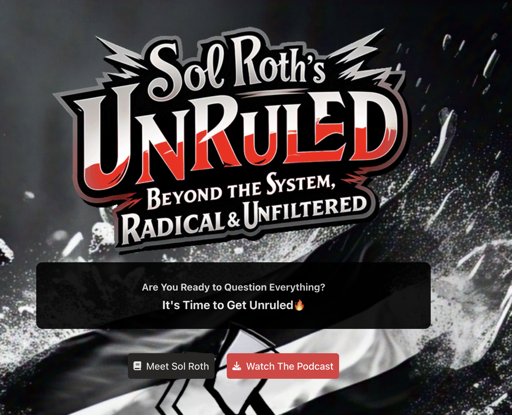
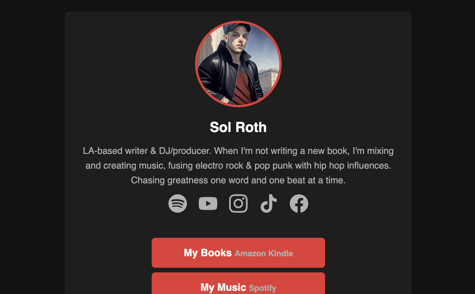
Axiom01 is already being used to build beautiful, semantic websites. Here are a few examples of live sites that are built with Axiom.
Released on July 27, 2025
Gzipped Core CSS
Components
Themes